When Amanda Bodkin encountered Red Disk’s “Queen City Toile” wallpaper at Buffalo’s Decorators’ Show House in 2021, it was love at first sight.
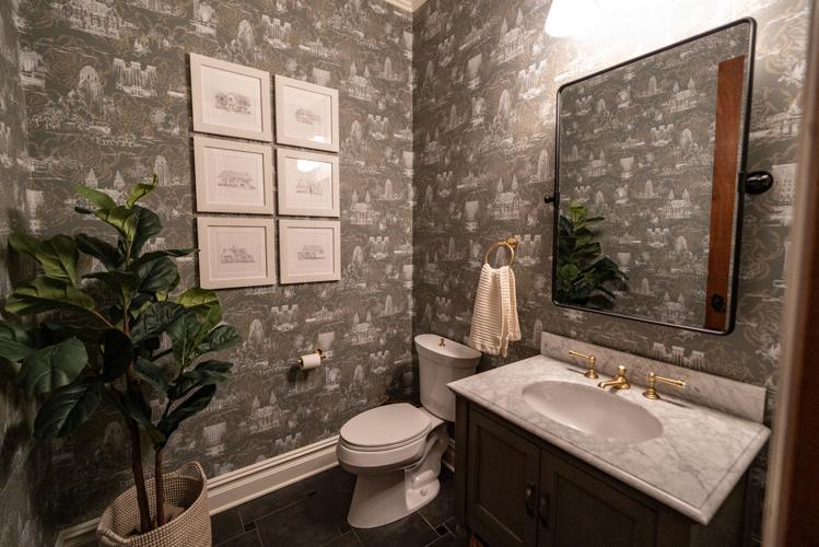
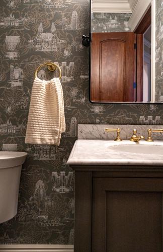
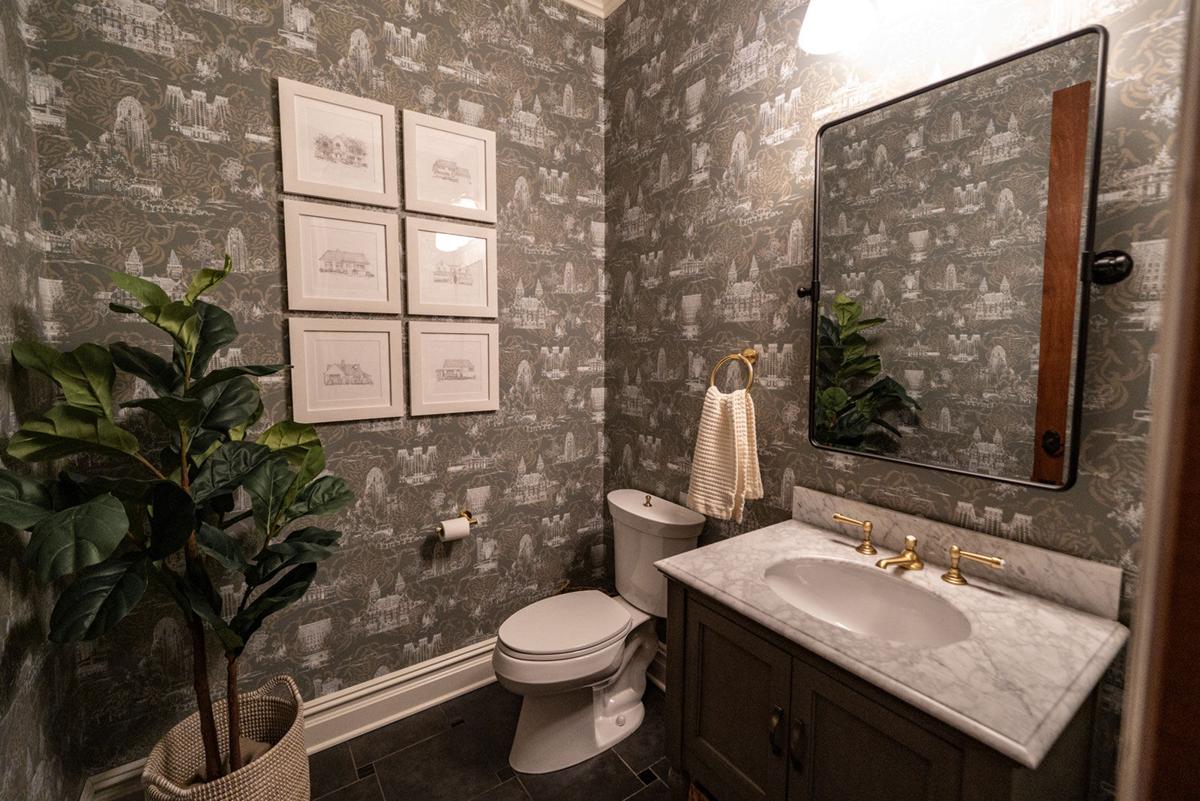
The remarkable print is an ode to Buffalo at the turn of the century, featuring some of our city’s most-recognized architectural jewels: Buffalo City Hall, the Buffalo Central Terminal and Shea’s Buffalo Theatre among them.
As it turned out, the nod to meaningful landmarks and to Amanda’s Buffalo roots was tugging at a thread, one that eventually became the overarching theme of a home refresh project she completed last year with Erin Kristine of New Leaf Interiors.
The idea to install the “Queen City Toile” wallpaper in the first-floor bathroom of Amanda’s East Amherst home was the catalyst of the project, which evolved to include a light renovation of the same bathroom, as well as a refresh of the living room and master bedroom. By refresh, Amanda and Erin agreed that no remodeling would take place, only cosmetic and furniture updates.
People are also reading…

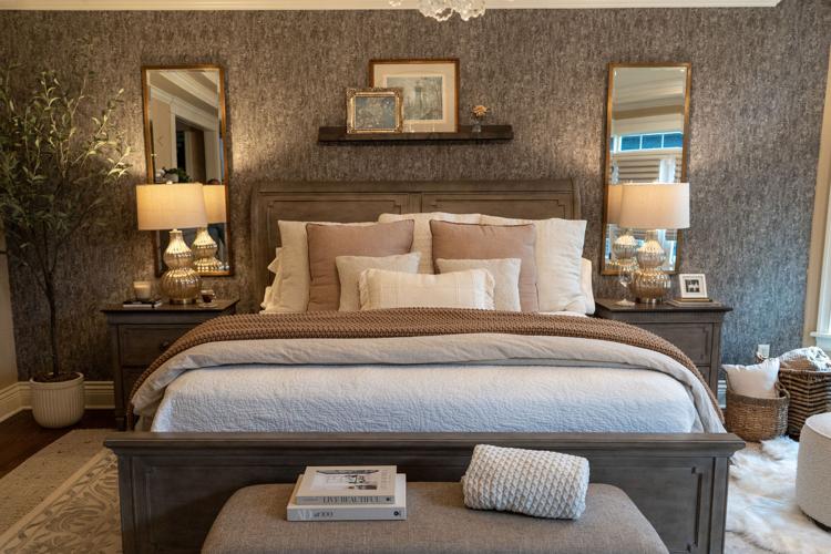
In the master bedroom, a separate, sisal rug anchors the existing printed rug, which on its own, felt undersized for the space. A Wolf-Gordon wallcovering and two twin accent mirrors were also added to set a grand stage for the master.
“We respected the composition of Amanda’s traditional-style home, which already features a lot of natural stone and wood,” Erin says. “Part of our approach for this project was making sure to bring in pieces that didn’t feel foreign or forced upon what was already established.”
Homeowners often gravitate toward the idea of expressing sentiment or personality via design elements throughout their home. Considering how to tread carefully when it comes to pieces that feel too niche or specific requires a delicate balance.
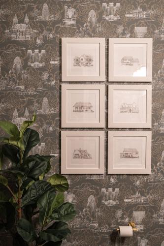
Here, the balance came from tasking artist and designer Elizabeth Rossi with creating a series of six sketches depicting homes of significance to the Bodkin family. The sketches are now featured in a gallery wall layered atop the “Queen City Toile” wallpaper in Amanda’s bathroom.

"For whatever reason, this house attracts people to come to it," says Amanda Bodkin.
“It’s an Easter egg in that you wouldn’t know what these houses are if you don’t know us,” Amanda says. “My husband and I each picked three houses, including the houses we grew up in and our grandparents’ homes.”
Both Amanda and her husband’s families were raised in Western New York, but many of their family members have since moved away. Now, holidays tend to feel like a homecoming of sorts for the extended family, an occasion that the first-floor bathroom rises to perfectly.
In terms of a place to gather, Amanda originally described the living room as “the most underutilized room in the house,” essentially a pass-through room that her two daughters would occasionally run through.

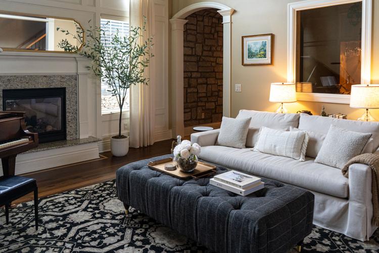
Reorienting the living room furniture layout in a way that encourages foot traffic permits a smarter use of the grand space. Specific placements that could accommodate new seating, such as the extra-deep sofa and custom ottoman, helped make the end result feel welcoming and inviting—not cluttered.
Erin attributed this to the living room’s former arrangement, which she remedied with a new furniture layout that offers maximum seating and encourages natural circulation patterns. New pieces like a comfy sofa and an oversized ottoman scale perfectly in the grand space, accented by tall ceilings, lots of natural light and an antique piano that’s an heirloom in Amanda’s husband Jack’s family.
“For whatever reason, this house attracts people to come to it,” Amanda laughs. “So I wanted this room to be beautiful but also to be the most usable space in the house.”
The elements of a successful home refresh

The black pivot bathroom mirror from Pottery Barn plays with the room’s balance yet again—a dark, minimalist pop atop the embellished wallpaper.
Below, find a few of the key pieces that rendered major impact, without elevating this project to a full-scale renovation.
Buffalo print wallpaper
The wall covering that Amanda originally fell in love with is screen-printed by Red Disk and features art by Kate Matchette. Erin recommended a version with the Damask overlay, which softened the graphic nature of the print and keyed into the gold tones of Amanda’s home.
A subdued green vanity
The new vanity in the first-floor bathroom was primarily selected for its dark green color, which wouldn’t draw the eye away from the wallpaper the way a lighter color would. A carrara marble top to the vanity added a lightness to the space, juxtaposing with Amanda’s existing dark floor.
Custom pattern for an oversized ottoman

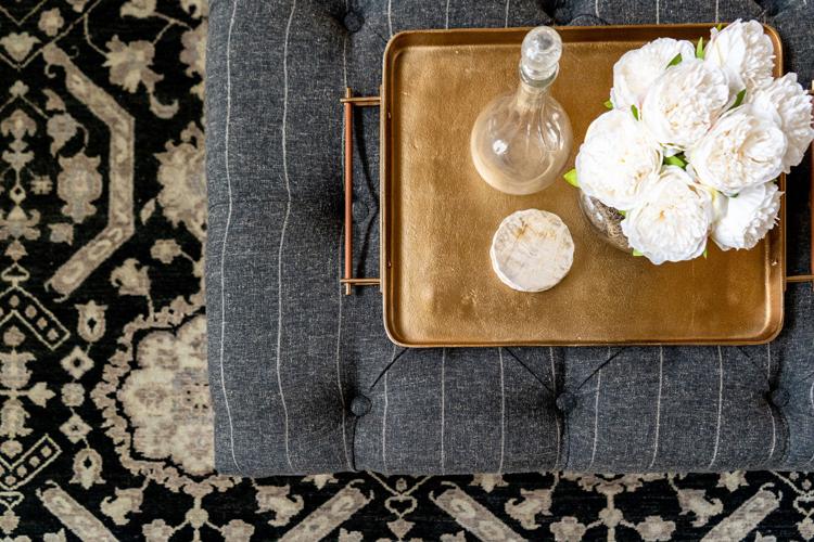
The goal for the updated living room was to maximize seating. For the oversized ottoman, Amanda and Erin opted to go the custom route, working with local furniture maker Matthew Burch to bring an elongated piece with a subtle stripe pattern to life.